Why don’t we start using a more accurate world map rather than Mercato
by Max Galka on 19 Dec 2016
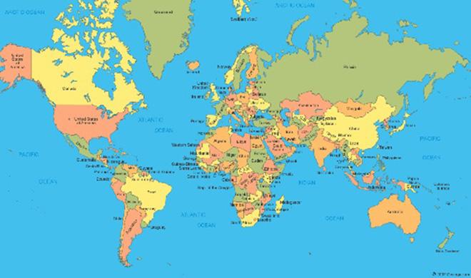
Mercator projection Max Galka
No 2D map can accurately show the 3D Earth. A map that is accurate in one respect is necessarily inaccurate in a different respect. But that doesn’t mean all 2D maps are created equal. So what are the problems with Mercator? Well there are four, listed below. Equally, if not that, then what should we use? Funnily enough, there are four alternatives, too! So let's look at at the issues and solutions...
1. Distorted sizes
The most obvious criticism is that it
distorts the size of countries near the poles. The classic example is Greenland vs Africa. On a Mercator projection, they look about the same size.
In reality Africa is *way* bigger than Greenland.
You can play around with the size distortions yourself on TheTruesize.com.
2. Cultural bias
The distorted sizes are not only a problem because they give a mistaken idea of what the world looks like. Mercator also increases the size, and arguably the perceived importance, of white nations in comparison to non-white nations.
Mercator maps are also commonly cropped in an uneven way that adds even more prominence to Europe and North America. The map below is from the North Dakota Historical Society. The equator was drawn on by me to show how far off center it is.
Some have gone so far as to call the Mercator projection “ racist. ” I disagree, but I don’t think it’s a stretch to say it is culturally biased.
3. Mercator is infinitely tall
Why is Mercator susceptible to being cropped as in the image above? Because it does not have a bottom or a top and always has to be cropped, leaving a lot of discretion to the person doing the cropping.
Here is what Mercator would look like if you were to crop its bottom further down.
That structure in the center is Amundsen–Scott South Pole Station. And those shapes at the bottom are individual snow flakes. If you were to continue even further, you would eventually reach the scale of individual atoms, and beyond.
Mercator may seem “normal” since we are all accustomed to seeing it, but it is really a very strange way of mapping the world.
4. Mercator is NOT well suited for navigation
Defenders of Mercator often claim that it is well suited for navigation, since straight lines on the globe appear as straight lines on the map. That is actually a fallacy.
It’s true that lines of constant compass bearing appear straight on the map. But lines of constant compass bearing are in fact curved. To illustrate, imagine you wanted to fly from New York to London. Looking at a Mercator map, you would think it’s a straight route across the ocean.
In reality, a straight line from New York to London, the route that airplanes actually take, crosses over a large chunk of Canada. This is clear when you see it on a 3D globe.
Although the lines in this next map appear curved, they are all actually straight on the globe. These are the routes that ships and planes actually take.
Why are we using Mercator in the first place?
As mentioned above, lines of constant compass bearing appear as straight lines on a Mercator map. At one time, before the invention of GPS, ships did used to travel this way — keeping their bow pointed in the same direction with respect to their compass along the entire route. In those times, Mercator really did serve a practical purpose.
These lines of constant compass bearing are known as rhumb lines. And though it may seem counter-intuitive, following the same direction on your compass actually takes you along a curved path.
What map should we be using?
1. Gall-Peters?
The original question points out the Gall-Peters projection as an example of a “good” 2D map. It is essentially a Mercator map that has been adjusted to remove the size distortions. But that causes other problems. Namely, the shapes of countries are all wrong.
Look at the shape of Greenland. It looks short and fat. In realty, the true shape of Greenland is tall and skinny, closer to how it looks in Mercator.
2. Miller?
The Miller projection is a compromise between Mercator and Gall-Peters. It retains most of Mercator’s shape, but removes some of the extreme size distortion. Here is how the three map projections compare side-by-side.
The Miller projection is the one I use most frequently, since it is one that people find familiar looking and easy to understand. But from an objective perspective, there are other possibilities I prefer.
3. Winkel-Tripel?
In addition to sizes and shapes, there are a few other ways that map projections can distort the globe. If you want to know more about how to measure a map’s accuracy, you can find a good writeup about it here. But when you take them all into account, one map projection that stands out as having a great balance is the Winkel Tripel projection.
The sizes are only slightly distorted, as are the shapes. Straight lines on the globe appear curved, but only slightly.
Winkel-Tripel also happens to be the map projection used by National Geographic. And I think there is a strong case that this is the one we should be using in classrooms.
4. Authagraph
I’ve saved the best for last.
The Authagraph was invented only a few years ago, in Japan. And already it is starting to take hold over there as the map projection of choice.
It challenges our view of what the world looks like, but it is highly accurate in all respects, so much so that it can be folded up to form a 3D globe.
Unlike the Winkel-Tripel, the Authagraph is rectangular, which makes it easier to work with from a cartographic perspective, and also better suited to presentation.
And it’s great looking.
My prediction: within our lifetimes, you will see the Authagraph hanging on classroom walls.
If you want to link to this article then please use this URL: www.sailworldcruising.com/150545